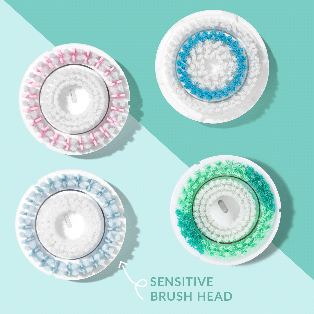
The goal of this campaign was to create a look book of assets for a new product, the Acne Cleansing Brush Head. The look book was distributed globally so that markets outside of the US have a guideline for how this product should be shown. My role was to tie together the existing model imagery with graphics related to the benefits that the product designer wanted to convey about the new brush head.
Client: Clarisonic / L’Oréal
This project is a set of assets provided to the global Clarisonic market as a guideline for a new applicator, the 3D Face Sculptor. My role was to create assets for email, site and organic social with art direction from the global marketing team.
Client: Clarisonic / L’Oréal
Art Direction: Jessie Sung
These emails were created to help the US Marketing team promote the brand and provide educational content. I worked directly with the CRM Marketing Manager at Clarisonic to create the content of each email.
Client: Clarisonic / L’Oréal
Art Direction: Amy Lackey & Alex Sivilay
These animated assets were created to support the Clarisonic social media channels. The purpose of these is to educate consumers and establish a connection with Clarisonic users. My role was to work directly with the Influencer Marketing Coordinator and either design something from existing assets or plan a photoshoot to create the required content.
Client: Clarisonic / L’Oréal
The purpose of this campaign was to announce the arrival of Afterpay. This was a huge campaign moment because it allowed Clarisonic to speak directly to potential consumers that have been interested in Clarisonic devices but have never purchased because of the price.
The overall goal was to gain new customers. My role in this campaign was to establish the look and feel of site and email assets. I chose blue blocks that slightly mimic the angular shape of the Afterpay logo.
Client: Clarisonic / L’Oréal
Art direction: Amy Lackey & Amanda Thornsley
For this project I took the lead in all the marketing efforts for Rio Grande Cancer Foundation's first annual 5k. The race was created to include all ribbon colors of cancer (not just pink) so the design had to reflect a theme of inclusivity. The first race was held on April 2, 2017 and was a huge success with over 3,000 participants.
Deliverables included: posters, race-day programs, digital banner ads, t-shirts, social media assets and environmental signage.
Awards: Gold in 2017 Cancer Awareness Advertising Awards
Client: Rio Grande Cancer Foundation
Agency: Lara & Company Creative
Art Direction: Monica Soltero
This website was a redesign of Lara & Company's old website. The goal was to show the personality of the studio and showcase a wider variety of projects.
Agency: Lara & Company Creative
The goal of this campaign was to drive sales, generate a higher basket quantity and a higher average order value. The Buy More Save More campaign required assets that showed the breakdown of spending tiers and additionally stood out from other site assets. My solution to this was a set of clean, yet colorful graphics with lines that divided each tier.
My role in this project was creating a homepage banner that was then used as the key visual for the entire campaign and was later localized by another designer into emails and secondary site assets.
Client: Clarisonic / L’Oréal