These are pieces I created in my spare time to practice combining two things I really enjoy—lettering and snacks.
Lettering projects outside of work have undoubtedly pushed me outside of my comfort zone. They have helped me experiment with new styles, practice creating work for a digital medium, and promote my work on social media.
For more, follow along on Instagram.
This set of illustrations were created to establish part of Clarisonic’s look on social media over the 2018 holiday season. The assets were included in Clarisonic’s 2018 Holiday Launch Book, which was distributed to global markets. The goal was to create illustrations and lettering that were simple and colorful with a strong product focus.
Client: Clarisonic / L’Oréal
Art direction: Stephanie Savidge
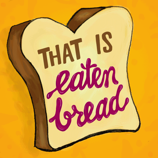
In college one of my best friends’ favorite activities was having me translate phrases in Spanish for her… literally word by word. The literal translation sometimes differed a lot from the actual meaning, but it made for a hilarious phrase nonetheless! Fast forward a few years and What the Phrase is born- a lettering project that takes common idioms in Spanish and translates them into English, just for the laughs.
This series is also a side project and another way for me to practice lettering for digital platforms.
Atypical Cards was created along with another designer, Becky Rodriguez. The side project showcases designs that are a little different than what a greeting card company might celebrate. These cards focus on everyday interactions and bring attention to them in a humorous way. All cards are hand lettered and can be viewed online by visiting Atypical Cards on Instagram.
These hand lettered cards were created for the Rio Grande Cancer Foundation, a local organization that provides resources to local cancer patients. These three cards are meant to be a more light-hearted alternative to the typical sympathy cards someone might find in a hospital gift shop or drug store.
Client: Rio Grande Cancer Foundation
Agency: Lara & Company Creative
These posters were created for an El Paso, Texas restaurant to advertise Sunday breakfast and sushi specials. The goal was to feature some tongue-in-cheek humor paired with dynamic typography and illustration.
Client: Geogeske
Agency: Lara & Company Creative
This ad campaign was for a coil manufacturer that advertises in an electrician’s industry magazine. The campaign itself focused on hand lettering and chalk drawing. The company is typically a challenge to advertise for because it is difficult to explain the concept of electric motor coils in a small ad. Instead their marketing focused on the things that make the company great, like quality service and free jalapeños with every order.
Client: Advanced Coil Technologies
Agency: Lara & Company Creative
Art Direction: Monica Soltero